Simplifying WhyDonate crowdfunding platform for everyone with the vision to aid financial access to achieve goals.
Project Summary
Capabilities
Team
Location
Model of Cooperation
UX Experience Improvisation
UI Design
Branding
Documentation
Client Partner
1 Product Designers
1 Visual Designer
Netherlands
Dedicated team
Capabilities
UX Experience Improvisation
UI Design
Branding
Documentation
Team
Client Partner
1 Product Designers
1 Visual Designer
Location
Netherlands
Model of Cooperation
Dedicated team
Industry
Communication Design, App Design
Overview
WhyDonate is a Europe-based crowdfunding platform for personal and organisations, which is used globally by millions of user to make difference in the world. That makes the spectrum of target audience for the platform quite wide . Considering the product significant amount of features and complex structure, the first step was to understand what user flows existed to date and how features were organized inside the system and then redefining and simplifying the flow to help customers to create fundraisers, promote and make donation easily.
Logo
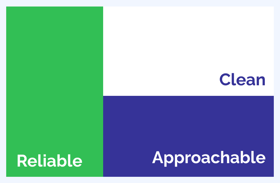
Existing logo was tweaked and refined to align with the values and tone of the brand. The tone is humble, positive, lively and reliable.
Visual Strategy
Visual strategy was curated on the base of insights we had from the end user of they see the brand. Visual language that is a perfect blend of techsavvy, friendly, professional, simple and intuitive.
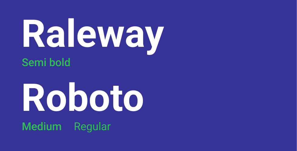
Typography
Selecting a typography plays vital role for a product which is used by millions of user with different skill sets. Keeping that in focus user eccentric approachable, font finalized has to be sans-serif font that’s highly legible for body content and for heading to keep the zest of the product values raleway was used.
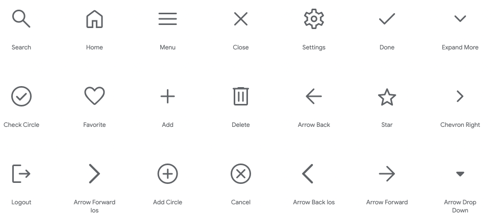
Icons
Keeping focus on user eccentric approach icons map out for interface are based on principle of simple, clean and sizable.
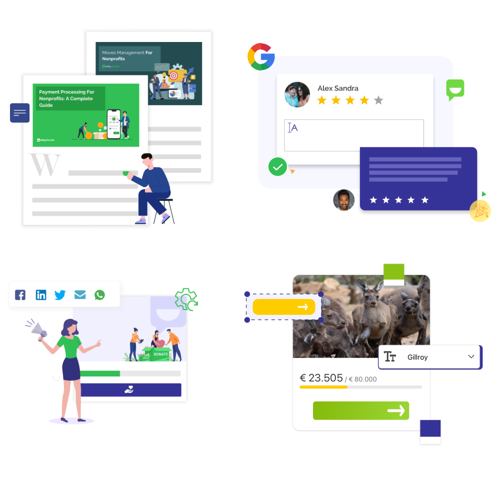
Graphics
Approach for graphic was to give glimpse of the product widgets. Keeping it clean, playful and inviting.
Solution Approach
Goal was to make platform a best tool for people to collect donations and make difference in the world. Before redefining the product, we took a step back and understood the type of end-users and grouped them into the primary, secondary, and tertiary levels. Considering the product’s significant amount of features and complex structure, the first step was to set main Goals, redefining the Flow concept and Information Architecture in the most optimized way. We reorganized features inside the system. Therefore, the strategy to follow had to ensure that users’ navigation was clear and intuitive. Consistency, Clear interactions, and Readability were taken into account as every detail matters when building solid foundations in order to scale.
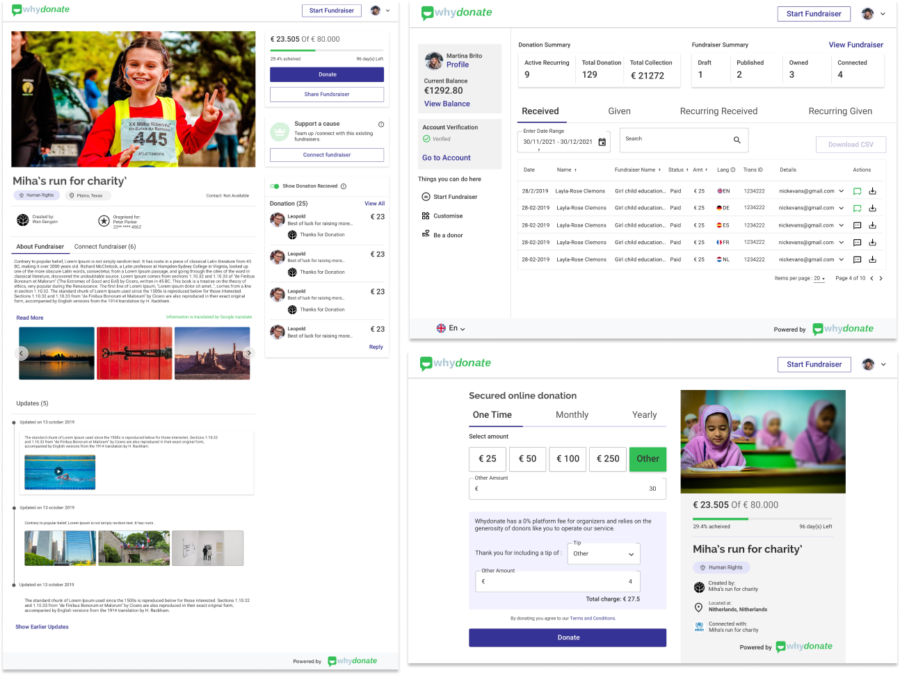
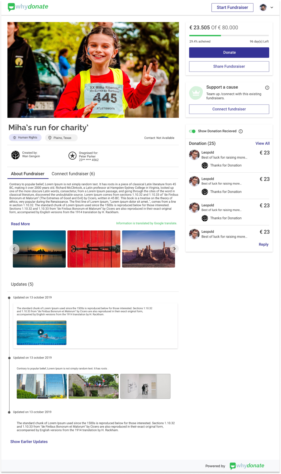
Fundraiser page
The Fundraiser page has the most crucial role in this product as it is the hero of the product where fundraiser creator will tell there story and explain the purpose of the crowdfunding. on other hand, donor will like to see the purpose and to whom they are donating to and why and what they need to achieve out of this. this all activity should give sense of authenticity to all the user coming to this page.
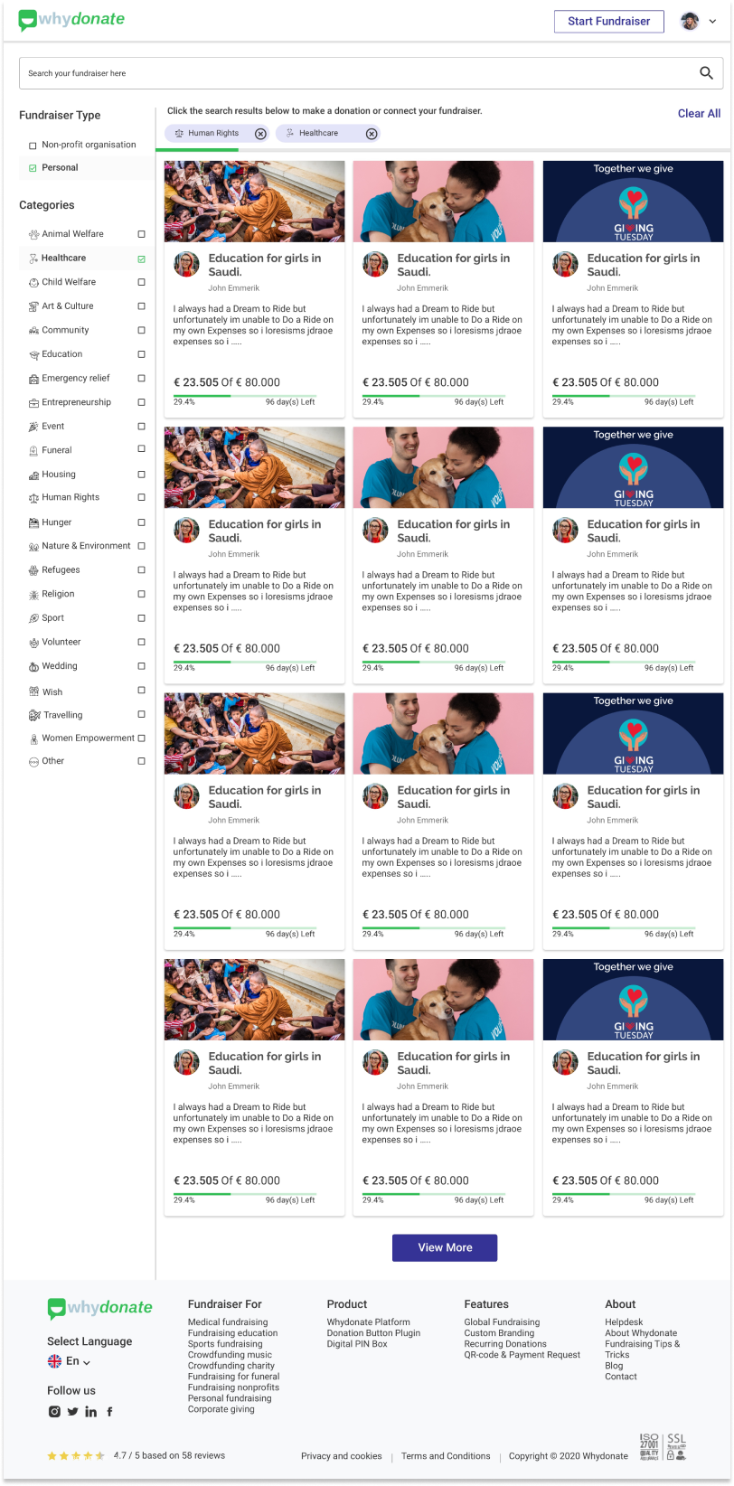
Search fundraiser
A page where anyone can come to find the cause they want to support. It should be the most easiest and simple task. So filters are introduced using tags to fundraisers to be quickly found in minimum seconds
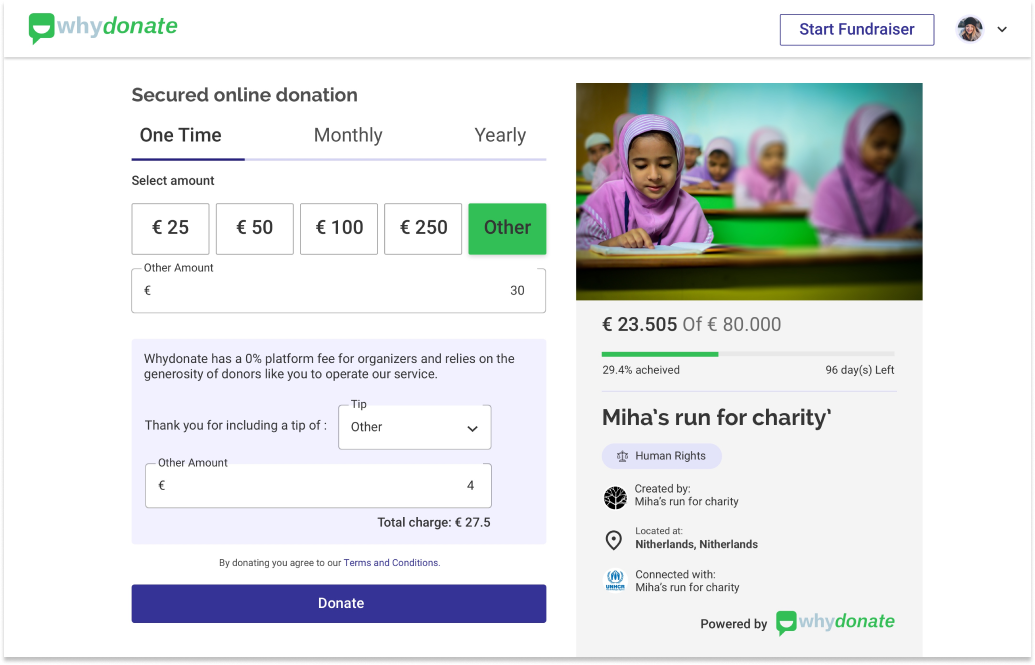
Donation page
Simplified form that donor to quickly make donation. By allowing them to see all the possibilities like one time donation, recurring donation, tip they will like to offer and more, before making donation and also swifts the process of donation.
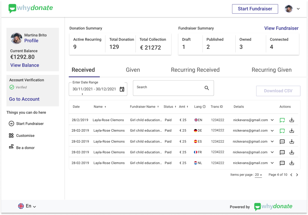
Dashboard
The comprehensive dashboard that provides customer a one-stop view to the summary of all fundraisers, details of crowdfunding donations and payout data.
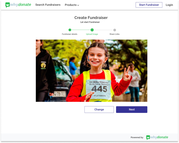
Create fundraiser form
Simplified forms and their experience, by applying basic rules of form by dividing them into semantic group, setting them in a steps form and aligning in right way and highlighting the one step at a time.
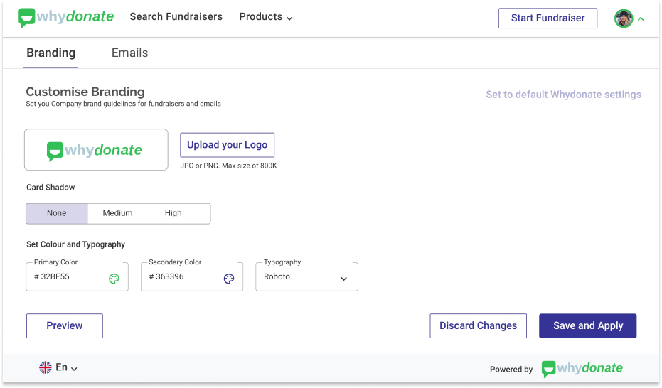
Custom Branding
Feature is build to allow the charity’s brand with custom content, logos, colours, images and buttons to personalise the fundraising experience. Quick and easy tailoring the fundraising pages.

 Scroll to Top