Colors are the foundation of any design, adding emotions and vitality to every creation. They set the mood and enhance brand identity simply by the first visual.
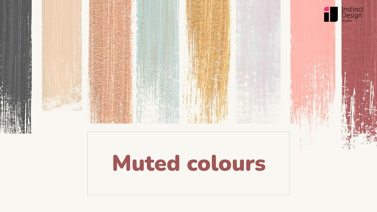
However, colors go beyond the basic palette you may have seen. These messengers of brand identity come in muted tones that offer a refined approach to design, emphasizing soft tones that create a balanced visual experience.
Using a carefully selected muted color palette can improve projects by raising calmness and sophistication, ensuring creative works remain modern and accessible.
Colors are more than just aesthetic choices; they directly impact user experience and engagement. From guiding user attention to improving readability, muted colors play a vital role in UX/UI design. Understanding why UX design is important is key to leveraging colors effectively in digital experiences.
TL;DR
- Muted colors are desaturated tones with subtle, refined aesthetics, offering a softer alternative to vibrant hues.
- They evoke calmness, sophistication, and balance, making them ideal for branding, UI/UX, web design, and packaging.
- Created by reducing saturation (mixing with gray, black, or complementary colors), muted palettes enhance readability and usability.
- Psychological impact: Muted tones reduce visual strain, improve focus, and create inviting, relaxing environments.
- Use cases: Branding, digital interfaces, typography, product packaging, and environmental graphics.
- Big brands like Casper, Buffy, and Everlane leverage muted colors to build a modern, trustworthy brand identity.
- Muted colors improve UX by reducing cognitive load, enhancing navigation, and creating a seamless user experience.
What are Muted Colors?
Muted Colors are less saturated and more subdued tones of otherwise bright and vibrant colors. These tones have hints of gray or a complementary color and radiate refinement and softness. Muted tones add aesthetics and balance to any design, offering elegance distinct from vivid alternatives.
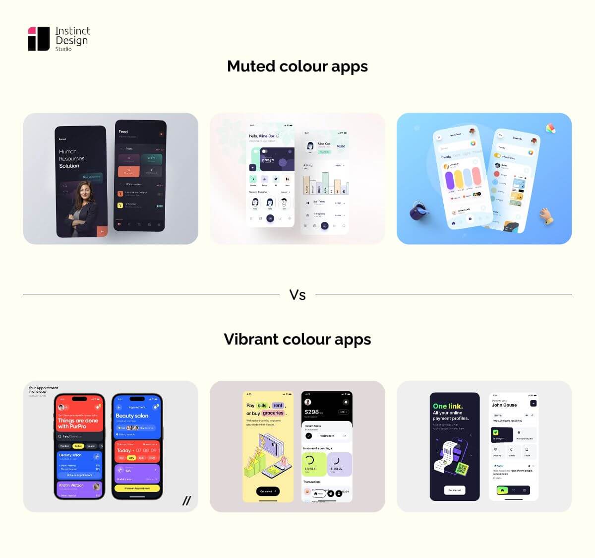
Difference Between Muted and Vibrant Colors
How are Muted Colors Created?
Muted color scheme is created by mixing base colors with gray or black, or lowering their saturation. By crafting this mix, the color scheme tames bright tones.
Psychological Impact of Muted Colors
Muted colors in modern design deeply affect our emotions and physiology. They evoke a sense of calmness and tranquillity, promoting relaxation.
The soft-gentle tones minimize harsh visual stimuli and create a soothing and inviting atmosphere. Their presence in the work and rest spaces supports concentration, reflection, and mental clarity.
A muted color palette has a gentle approach that can stimulate innovative thinking while promoting a peaceful mindset. As the Hayes escape the intensity of vibrant options, they inspire a sense of peace and renewed focus.
Due to their psychological impact, these soft colors are valuable in designing spaces that nurture relaxation, thoughtful engagement, and a positive state of mind.
Muted colors play a crucial role in industries where trust and clarity are essential—such as fintech. A well-designed financial app uses soft, neutral tones to create a sense of security and professionalism. Discover how Fintech UX design leverages colors to enhance user confidence and engagement.
How to Use Muted Colors Effectively?
Here’s how businesses can use muted colors in designing:
1. Branding & Identity
Branding and identity develop on consistency and subtlety, making the color palette a strategic choice. A selection of muted color tones can push a brand, evoking sophistication and reliability without overwhelming the viewer. Modern design concepts use muted colors for refined visual storytelling that balances bold brand elements with understated elegance.
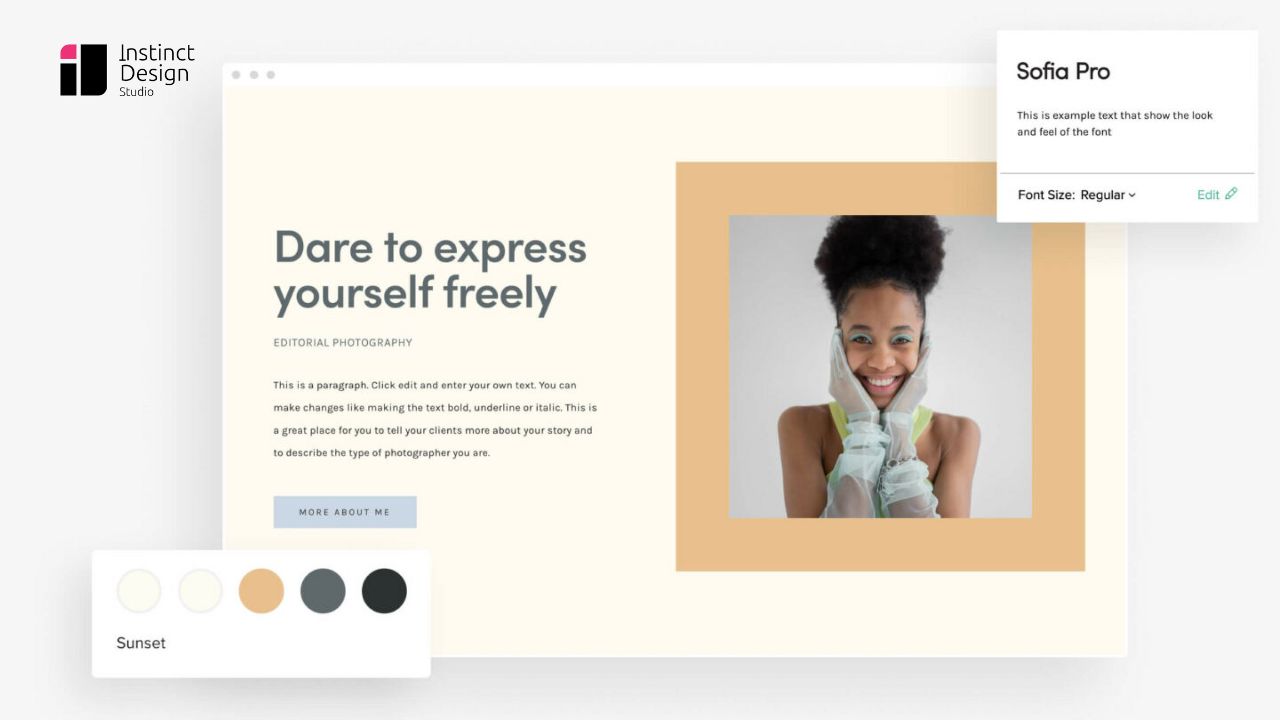
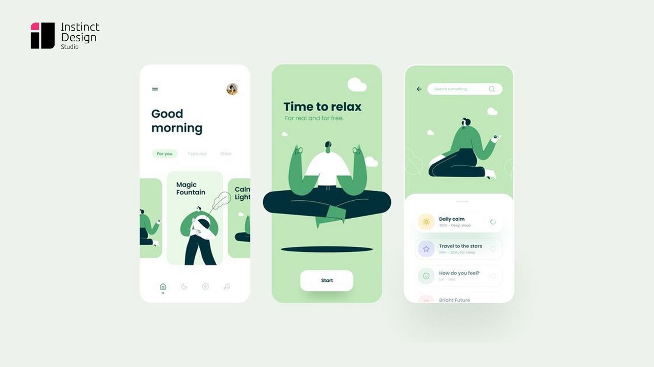
2. UI/UX Design
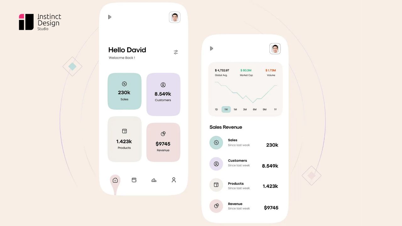
Muted colors in modern design enhance digital interfaces by reducing visual clutter and emphasizing functionality. A careful application of a muted color scheme creates intuitive, user-friendly experiences. Designers benefit from balanced, clear layouts that support navigation and accessibility, ultimately leading to more engaging and effective interactions across platforms
3. Typography & Contrast
Pairing expressive typography with soft, muted tone colors boosts readability and balance between text and background. Designers can achieve optimal contrast by selecting fonts that complement these gentle hues. Consider examples of muted colors to balance text and background, ensuring clarity and sophistication while reinforcing an overall harmonious design.
For small businesses, muted color schemes ensure a modern, polished look while maintaining readability and professionalism. The right balance between typography and colors can enhance brand perception. Check out these web design tips for small businesses to create a strong digital presence.
4. Web App Design
Muted colors are increasingly popular in web app design for creating clean, modern interfaces that prioritize user experience.
Web designers use a carefully curated, muted color palette to balance aesthetics and functionality. Using muted tones helps reduce visual noise, ensuring the key elements shine without overwhelming the users.
This design approach fosters clarity, improves readability, and guides intuitive navigation across digital platforms.
Web applications benefit from muted colors by offering a modern, distraction-free interface. If you’re looking for expert guidance, check out our web app design services for seamless and engaging experiences.
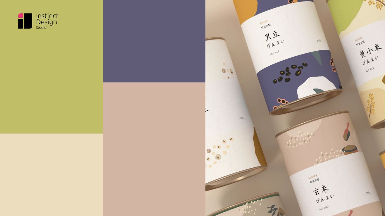
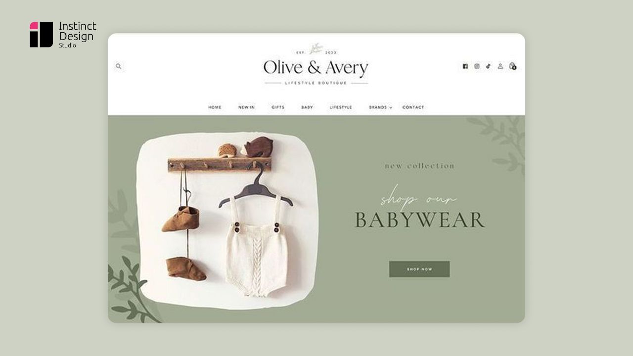
5. Print & Packaging
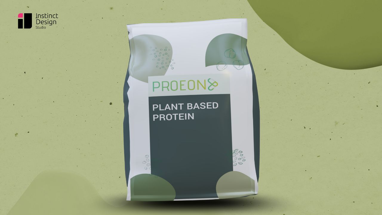
Muted colors add refined elegance to print and packaging by simply elevating the product presentation. Designers choose a carefully muted color scheme to create packaging that stands out in competitive markets without overwhelming consumers. Soft, understated hues help drive attention to key product details and essential messaging.
By using a well-balanced muted color scheme, brands subtly convert modernity and trust, making it easier for consumers to connect.
A well-balanced muted color palette enhances digital interfaces by reducing visual noise and guiding users effortlessly. By mapping out the user’s journey, designers can identify where muted colors can improve accessibility and engagement. Learn more about how a UX journey map helps in structuring user flows and optimizing design decisions.
Design Apps That Users Love
User expectations are higher than ever—your app needs to be intuitive, visually appealing, and optimized for engagement. We specialize in creating UX/UI designs that not only look stunning but also drive conversions and user loyalty.
Start Your UX/UI Journey with Us – Let’s Talk!Check out Some Popular Muted Colors
Their correct usage turns ordinary projects into sophisticated works of art.
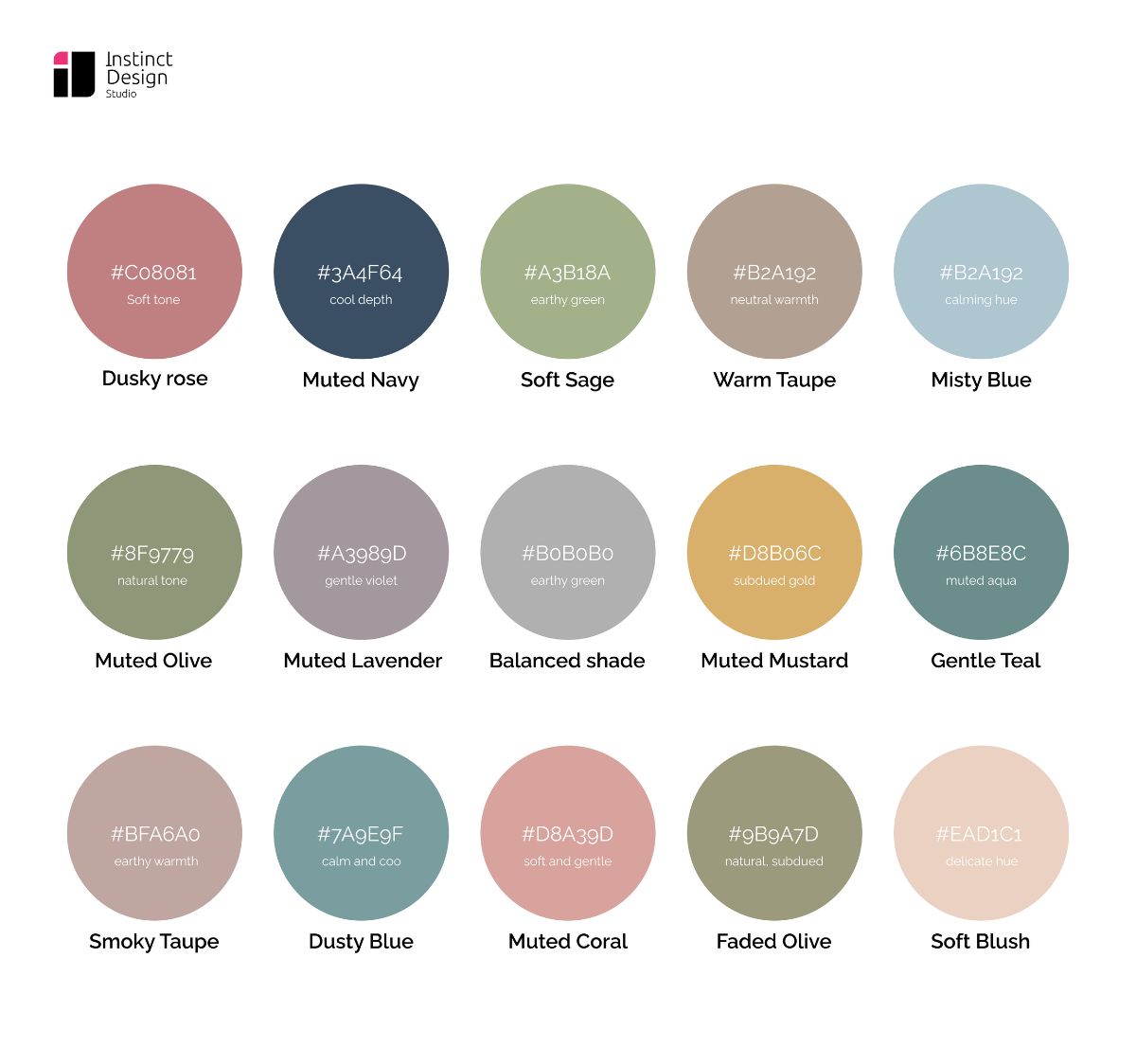
Muted Colors Palette Inspiration for Modern Design
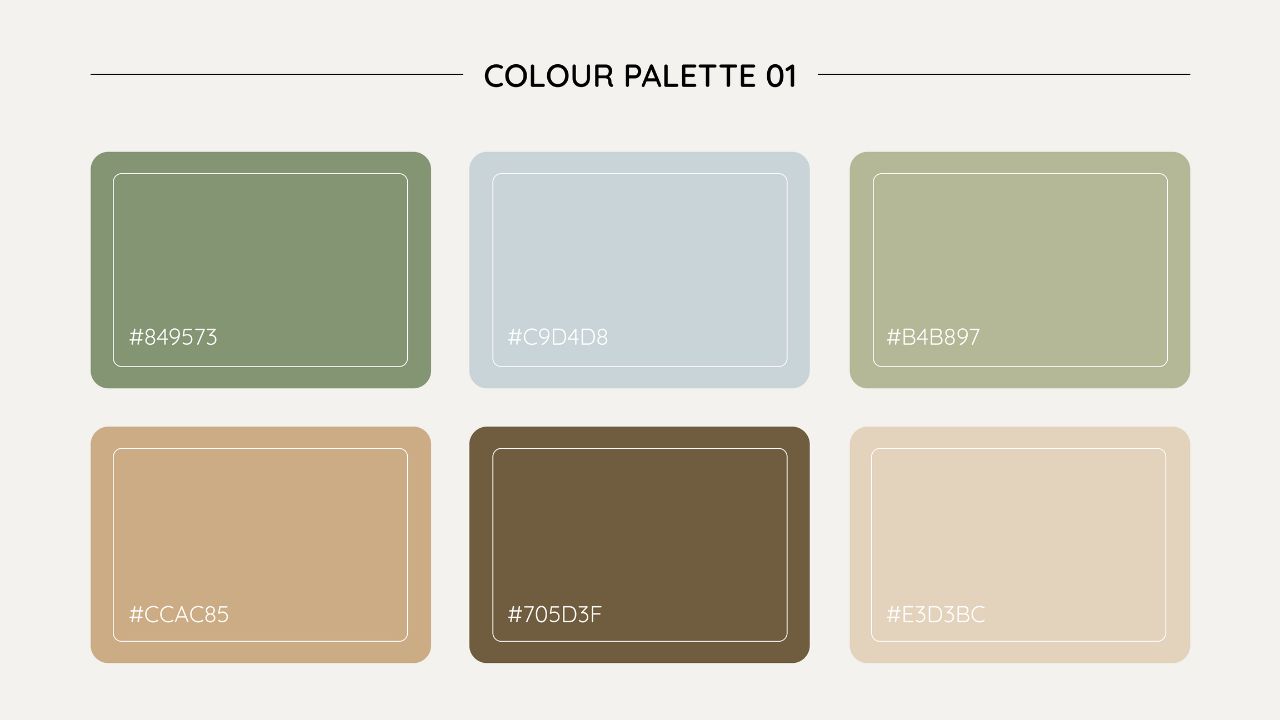
Here are some inspiring palettes featuring muted color tones for modern design:
- Dusty Mauves with Taupe Accents: Provides subtle sophistication for branding.
- Deep Charcoal with Delicate Blush: Striking yet soft, capturing the essence of muted tone colors.
- Charcoal & Blush: A refined contrast for contemporary aesthetics, reflecting the charm of muted tone colors.
- Earthy Olive & Terracotta: Conveys a grounded, organic aesthetic for eco-conscious brands.
Where to Use Muted Colors: Practical Applications
Muted colors offer a refined design foundation that brings balance and clarity to various creative projects. By setting a calm tone, they improve usability and visual appeal. Here are practical areas to apply them:
- Digital Interfaces: Gentle hues improve user navigation and reduce visual noise, making apps and websites easier to use.
- Brand Identity: Muted tones build a trustworthy image. It contributes to the distinctive and enduring brand presence.
- Print Media: Soft colors in brochures, posters, and magazines add a modern and understated elegance that attracts attention.
- Interior Environments: Light, muted shades create welcoming atmospheres in offices, retail spaces, and homes, promoting comfort.
- Product Packaging: An understated palette gives products a premium look, highlighting quality and sophistication.
- Environmental Graphics: Calm backgrounds in exhibitions and public displays provide balanced visuals that enhance the overall experience.
Each application benefits from the serene quality of muted colors, guaranteeing designs remain both attractive and functional remarkably.
Enhancing User Experience with Muted Colors Palette
- A muted color palette boosts interface lucidity, clearly delineating design elements to direct user attention efficiently.
- Subdued, neutral tones cultivate an atmosphere of tranquility, easing cognitive load during extended interaction periods consistently.
- Restrained hues enable seamless navigation, guiding users through content with intuitive, streamlined transitions at every step.
- An organized, muted color scheme minimizes visual clutter, enhancing overall coherence and strengthening the design’s structure.
- A refined palette uplifts user satisfaction by creating a balanced, engaging digital environment that inspires trust.
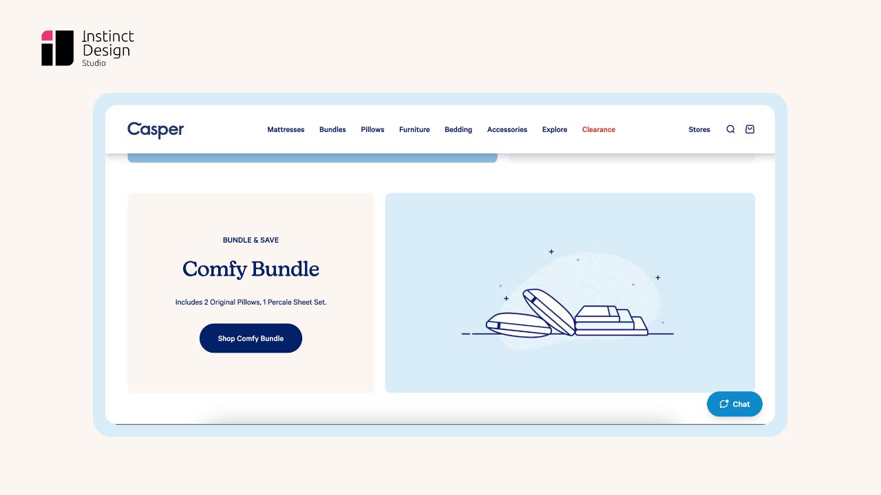
Even Big Brands Use Muted Colors
Here’s how businesses can use muted colors in designing:
1. Casper
2. Buffy

3. Everlane
Integrate Muted Colors Seamlessly
Enhance your web app or brand identity with a sophisticated muted color palette that captivates and engages your audience.
Contact Us for a Free ConsultationFinal Thoughts about Muted Colors in UI/UX Design
Overall, muted colors redefine design by setting a quiet stage that opens space for imaginative detailing. They empower designers to layer textures and gentle gradients, creating interactive experiences that are modern, refined, and uniquely inviting.
FAQs
Muted colors refer to low-intensity hues that gently blend into backgrounds, offering understated elegance without harsh brightness and providing a soft ambiance.
Innovative color application creates fluid interfaces, unifying functionality with beauty through a muted color scheme that subtly guides user experience.
Superior muted colors feature soft neutrals, gentle pastels, and light grays, harmoniously blending to create balanced, versatile design solutions ideally.
A muted pattern uses low-key design elements and arranges them harmoniously, using textures and gentle gradients. It is well utilized to maintain a calm, unified layout.
Muted colors have less chroma, and they are not completely saturated. In contrast, saturated colors have intense vibrancy and boldness, creating a dynamic visual impact.